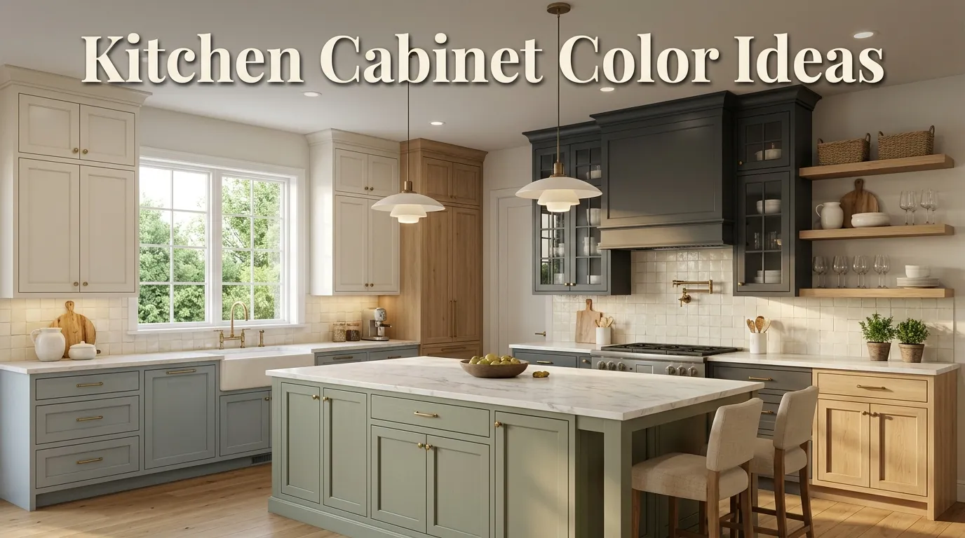
10 Kitchen Cabinet Color Ideas
Kitchen cabinets take up a surprising amount of visual space, so changing their color can completely alter the personality of a kitchen without replacing the entire room. Whether you are refreshing a dated kitchen, planning a budget-friendly makeover, or simply saving ideas for your next home project, the right cabinet color can make the space feel warmer, brighter, larger, or more sophisticated.
The tricky part is choosing a color that looks beautiful in your actual kitchen, not just in a perfectly styled Pinterest photo. Natural light, countertop materials, flooring, backsplash colors, hardware, and even the direction your windows face can change how a cabinet paint color appears throughout the day.
That is why it helps to think beyond whatever shade happens to be trending. A soft green might look gorgeous in a sun-filled kitchen but feel completely different in a darker room. A crisp white can make a small kitchen feel open, while a deep navy can add dramatic contrast to an otherwise neutral space.
The good news is that you have plenty of options. From timeless white and warm greige to earthy green and dramatic navy, cabinet colors can be tailored to almost any decorating style.
Below, you’ll find ten versatile ideas, along with practical styling tips to help you decide which direction makes sense for your kitchen. Whether your home leans modern, farmhouse, traditional, transitional, or comfortably eclectic, there is an option worth considering.
Table of Contents
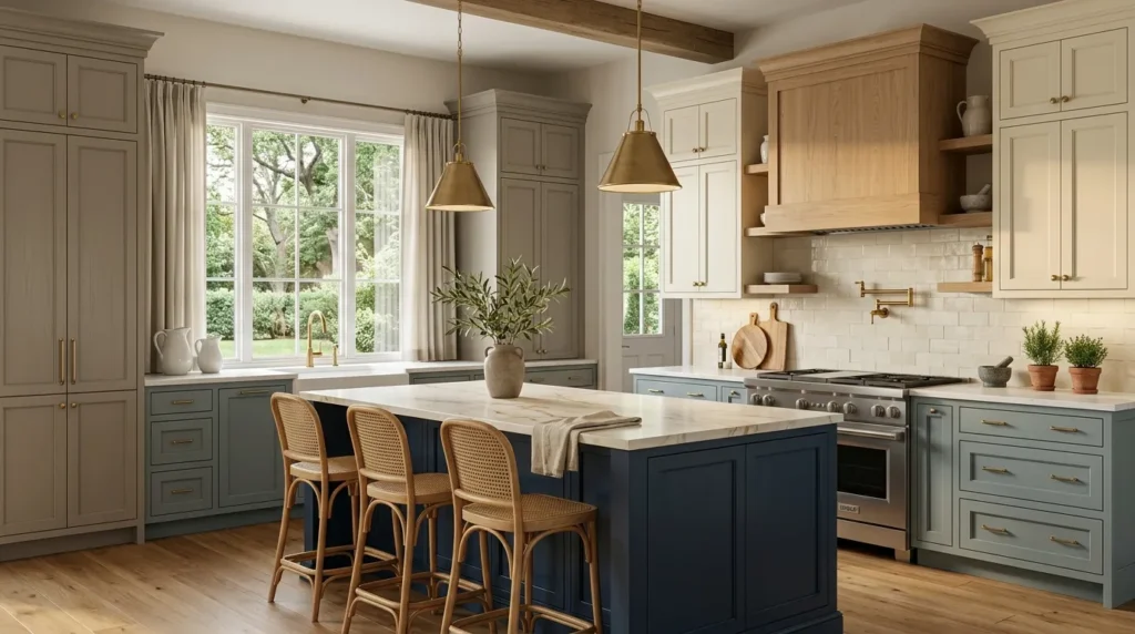
1. Classic White
A timeless choice that keeps kitchens bright, clean, and flexible.
2. Warm Greige
A balanced neutral that adds warmth without feeling heavy.
3. Soft Sage
An earthy green that brings a relaxed, natural feeling indoors.
4. Deep Navy
A sophisticated dark shade that creates beautiful contrast.
5. Creamy Ivory
A softer alternative to bright white for warm, inviting kitchens.
6. Charcoal Gray
A dramatic neutral that works especially well with modern finishes.
7. Dusty Blue
A gentle blue that adds personality while remaining easy to style.
8. Natural Wood
A warm, organic option that highlights texture and craftsmanship.
9. Muted Taupe
A sophisticated neutral for understated, layered interiors.
10. Two-Tone Cabinets
A flexible combination that adds dimension without overwhelming the room.
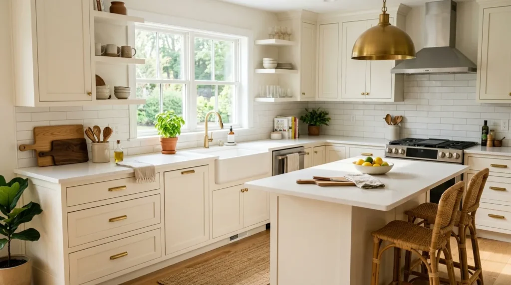
1. Classic White
Quick Benefits
- Makes the kitchen feel brighter
- Works with almost any countertop
- Creates a clean, timeless appearance
- Pairs easily with different hardware finishes
- Helps smaller kitchens feel more open
Why It Works
White cabinets remain popular for a reason: they provide one of the most adaptable foundations for kitchen design. A white cabinet finish reflects available light and creates a clean backdrop for everything from natural wood accents to colorful tile.
The key is choosing the right type of white. Very bright, cool whites can feel crisp and contemporary, while warmer whites create a softer and more traditional atmosphere. Look at your countertop and backsplash before deciding. If those surfaces have warm undertones, a slightly warmer cabinet white usually feels more cohesive.
White also gives you room to change your decorating style later. You can switch brass hardware for black pulls, introduce colorful accessories, or change your bar stools without having to redesign the entire kitchen.
How To Style It
Pair white cabinetry with natural wood cutting boards, woven counter stools, or open shelving to keep the space from feeling too sterile. Marble-look countertops create an elegant combination, while butcher block adds warmth.
For hardware, brushed brass can create a classic look, matte black gives stronger contrast, and brushed nickel keeps things understated.
If your kitchen receives limited natural light, consider a warm white rather than an icy white. Use warm-toned lighting in the evening so the cabinets maintain a welcoming appearance after sunset.
For a Pinterest-friendly look, keep countertops relatively uncluttered and add a few intentional details such as a ceramic vase, wooden board, or small potted herb.
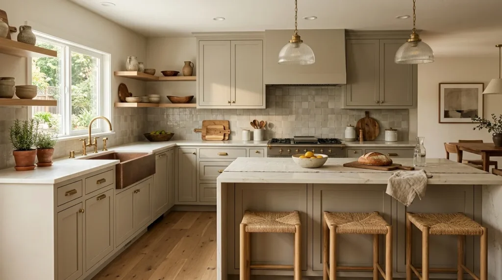
2. Warm Greige
Quick Benefits
- Combines gray and beige beautifully
- Adds warmth without overwhelming the room
- Works with both cool and warm finishes
- Creates an upscale neutral backdrop
- Easy to accessorize
Why It Works
Greige sits comfortably between gray and beige, making it particularly useful when you want a neutral kitchen that feels more interesting than plain white. It can soften a space while still maintaining a polished appearance.
This shade is especially helpful when your kitchen contains several competing undertones. For example, if the flooring has warm wood tones but your countertop has subtle gray veining, the right greige can visually connect the two.
Lighting matters considerably here. Some greige paints can appear beige in warm afternoon sunlight and more gray in cooler light. Always test a sample directly on the cabinet before committing to the entire kitchen.
The beauty of this color is its restraint. It doesn’t demand attention, which allows architectural features, countertops, pendant lights, or a beautiful backsplash to become part of the overall design.
How To Style It
Warm greige cabinets pair beautifully with light quartz countertops, natural stone, creamy backsplashes, and medium-tone wood flooring.
For a softer kitchen, choose aged brass or champagne-colored hardware. For a more contemporary look, try matte black pulls.
Keep the styling natural with linen textiles, wooden accessories, ceramic pitchers, and greenery. If the cabinets are a medium greige, consider using lighter countertops and a lighter backsplash to maintain visual balance.
A useful trick is to repeat the cabinet undertone somewhere else in the room. For example, if your cabinets have warm beige undertones, incorporate a similarly warm rug, pendant shade, or wood accessory.
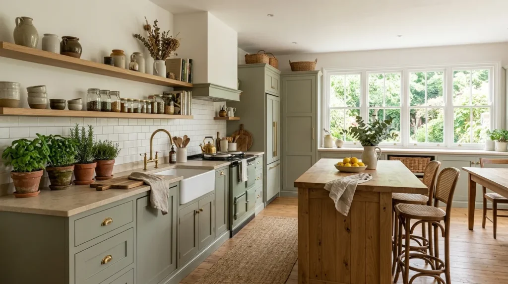
3. Soft Sage
Quick Benefits
- Brings an earthy feeling into the kitchen
- Works beautifully with natural materials
- Adds color without becoming overpowering
- Complements white and wood
- Fits farmhouse and modern styles
Why It Works
Soft sage green is one of those colors that can introduce personality while still behaving almost like a neutral. Its muted, gray-green quality makes it much easier to live with than a highly saturated green.
The color naturally connects a kitchen with the outdoors, particularly when the room has windows overlooking a garden, trees, or greenery. It also works well with natural materials such as oak, rattan, stone, and ceramic.
A mistake many homeowners make is choosing a green that is too bright for the rest of the room. If you want a sophisticated result, look for muted or gray-infused greens rather than intense emerald or lime tones.
Sage can work across several design styles, from relaxed farmhouse kitchens to contemporary spaces with simple slab cabinets.
How To Style It
Pair sage cabinetry with warm white walls and light countertops for a fresh look. Natural oak shelves or a wood island can add another layer of warmth.
For hardware, brushed brass creates a softer, traditional feel, while black hardware gives the green more definition.
Keep accessories relatively simple. A few terracotta pots, wooden utensils, woven baskets, and leafy plants can reinforce the natural palette without turning the kitchen into a themed space.
If you have a small kitchen, consider using sage on the lower cabinets while keeping upper cabinets white. This creates color and personality without making the entire room feel visually heavy.
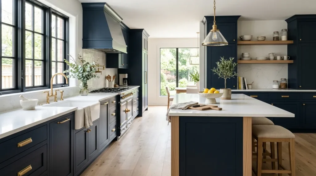
4. Deep Navy
Quick Benefits
- Creates dramatic contrast
- Looks sophisticated and timeless
- Works well with white countertops
- Makes brass hardware stand out
- Adds depth to larger kitchens
Why It Works
Deep navy is a strong choice when you want your cabinets to become one of the defining features of the kitchen. Unlike pure black, navy introduces subtle color while retaining the visual drama of a dark finish.
It can look particularly striking alongside white quartz, marble-inspired surfaces, or light backsplashes. The contrast creates a crisp appearance that works well in transitional and contemporary kitchens.
Dark cabinets can sometimes make a room feel smaller, so natural light becomes important. In a kitchen with generous windows, navy can feel rich and sophisticated. In a darker kitchen, using navy selectively may be a better approach.
One simple trick is to use a dark cabinet color on the island rather than every cabinet. This creates a focal point while allowing the surrounding cabinetry to remain light.
How To Style It
Navy pairs exceptionally well with warm metallic hardware. Brass or antique-gold pulls can provide a beautiful contrast, while chrome or nickel creates a cooler, cleaner effect.
For countertops, choose a light surface if you want the kitchen to feel airy. Natural wood stools or cutting boards can soften the darker palette.
If you’re using navy on all cabinetry, keep the backsplash relatively calm. Too many competing patterns can make the kitchen feel busy.
For an especially polished appearance, repeat the navy somewhere else in the room through bar stools, artwork, or a small decorative accent.
5. Creamy Ivory
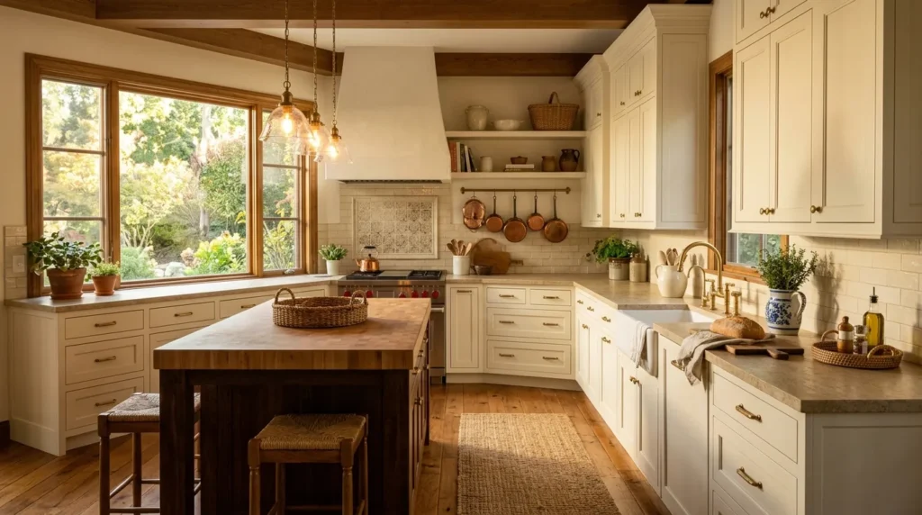
Quick Benefits
- Feels warmer than bright white
- Creates a welcoming atmosphere
- Works beautifully with traditional kitchens
- Complements wood tones
- Softens strong natural materials
Why It Works
Creamy ivory offers the brightness of a light cabinet color without the sharpness that some pure whites can have. It is particularly appealing in homes where warmth and comfort are more important than a highly crisp modern aesthetic.
This color works beautifully with natural stone, warm wood floors, antique-inspired hardware, and traditional architectural details. It can also make older kitchens feel refreshed without making them look completely disconnected from the character of the home.
If your kitchen already contains warm beige, tan, or honey-colored elements, ivory may blend more naturally than a cool white.
The important distinction is choosing an ivory that doesn’t become too yellow. Test samples beside your countertops and flooring under both daylight and artificial lighting.
How To Style It
Try combining ivory cabinets with warm wood flooring, a creamy backsplash, and aged brass hardware. The result can feel collected and comfortable rather than overly coordinated.
For countertops, light quartz or softly veined natural stone works well. Wooden boards and ceramic accessories add subtle texture.
You can also introduce contrast through darker window frames, pendant lights, or stools. The goal is to create layers rather than making every surface the same shade.
If you like traditional kitchens but want them to feel current, combine ivory cabinets with simple hardware and clean-lined lighting.
6. Charcoal Gray
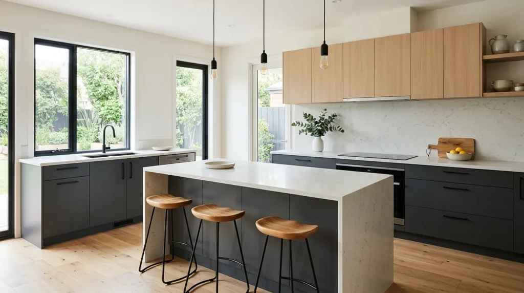
Quick Benefits
- Adds sophisticated contrast
- Works well in modern kitchens
- Hides everyday marks better than very light colors
- Complements metal finishes
- Creates a strong visual anchor
Why It Works
Charcoal gray is a practical choice for homeowners who want something darker without committing to black. It provides depth and contrast while remaining relatively neutral.
The shade can work particularly well on islands or lower cabinets because it visually grounds the room. When combined with lighter upper cabinets, it creates a balanced two-tone effect.
Charcoal also provides an excellent backdrop for stainless steel appliances. Instead of competing with the metallic surfaces, it helps them feel integrated into the design.
As with any dark cabinet color, consider the size and natural lighting of your kitchen. A charcoal finish can be dramatic and elegant, but too much of it in a poorly lit room may feel heavy.
How To Style It
Pair charcoal cabinetry with white or light-gray countertops for contrast. Warm wood accents can prevent the room from feeling overly industrial.
Matte black hardware creates a monochromatic look, while brushed brass introduces warmth.
For backsplash materials, simple white subway tile, light stone, or softly textured ceramic can work well. Avoid adding too many dark surfaces at once unless you’re intentionally going for a moody kitchen.
A charcoal island with lighter surrounding cabinets is an easy way to experiment with the color without covering the entire kitchen in a dark finish.
7. Dusty Blue
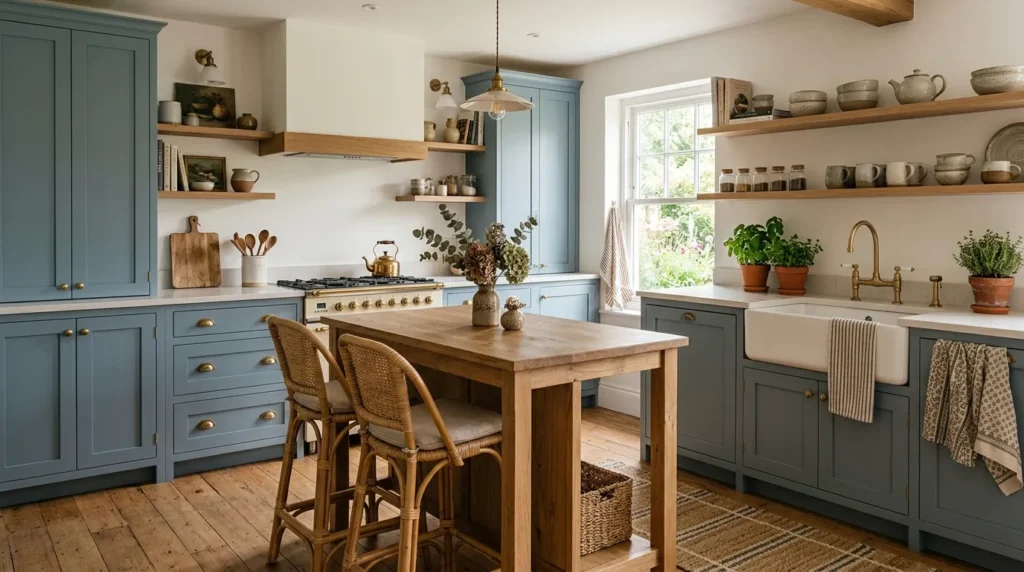
Quick Benefits
- Adds subtle color
- Creates a calm atmosphere
- Works with white and natural wood
- Fits coastal and cottage-inspired kitchens
- Feels softer than saturated blue
Why It Works
Dusty blue is ideal for homeowners who want color but aren’t ready for something intense. Its muted quality allows it to function almost like a neutral while still giving the kitchen a distinct personality.
It can create a relaxed, airy feeling, particularly when paired with white walls and natural materials. Depending on the exact undertone, dusty blue can lean coastal, traditional, cottage-inspired, or even contemporary.
The best versions are usually softened with gray, preventing the color from becoming overly bright. This makes it easier to incorporate into an existing kitchen without having to change every other element.
Dusty blue is also a good choice for cabinetry that you want to feel visually lighter than a deep navy or charcoal.
How To Style It
Combine dusty blue cabinets with warm white walls, pale countertops, and natural oak accessories. Brass hardware can make the combination feel more elevated, while nickel keeps it casual.
For a cottage-inspired kitchen, consider ceramic pendant lights, woven stools, and simple patterned textiles.
For a more modern approach, use flat-panel cabinetry, streamlined hardware, and minimal countertop accessories.
If you’re uncertain about committing to the entire kitchen, use dusty blue on an island or lower cabinets first.
8. Natural Wood
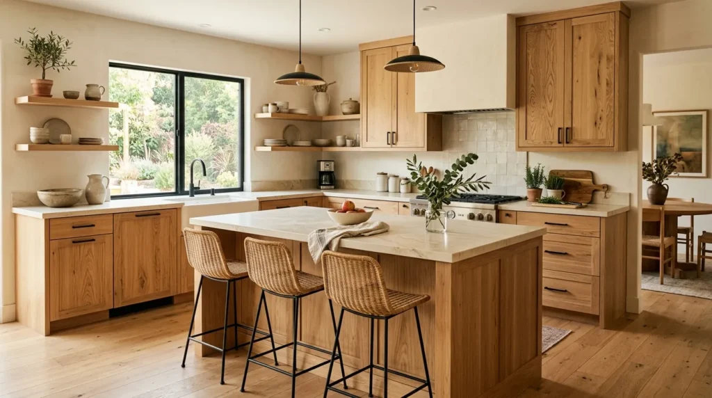
Quick Benefits
- Adds warmth and texture
- Highlights natural material character
- Works across many design styles
- Creates an organic atmosphere
- Ages beautifully when properly maintained
Why It Works
Paint isn’t the only way to change the appearance of kitchen cabinets. Natural wood brings warmth, texture, and visual variation that painted finishes simply cannot replicate.
Oak, walnut, maple, and other wood species can create very different moods depending on their grain, stain, and finish. Light oak tends to feel airy and contemporary, while walnut can create a richer and more dramatic atmosphere.
Natural wood also works especially well when the rest of the kitchen contains stone, ceramic, linen, or metal. These materials create the layered texture that makes a kitchen feel lived-in rather than overly staged.
If you’re working with existing wood cabinets, refinishing them may be an alternative to replacing them entirely.
How To Style It
Keep the surrounding palette relatively restrained so the wood grain remains a visual feature. Soft whites, warm neutrals, and muted greens can complement natural wood beautifully.
Choose hardware based on the character of the wood. Brass can add warmth, while black hardware creates stronger contrast.
Avoid matching every wood element exactly. A kitchen can feel more natural when the flooring, stools, cutting boards, and cabinetry have slightly different tones.
For a modern kitchen, pair light wood cabinets with simple countertops and minimal hardware. For a more traditional space, richer wood tones can work with decorative details and classic lighting.
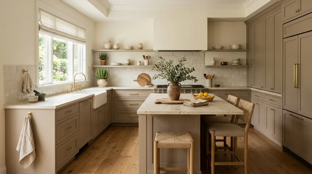
9. Muted Taupe
Quick Benefits
- Creates a sophisticated neutral palette
- Feels warmer than standard gray
- Works with many natural materials
- Provides subtle visual depth
- Easy to update with accessories
Why It Works
Muted taupe is a quiet color, but that doesn’t mean it has to look boring. Its mixture of brown, gray, and beige undertones can create a sophisticated foundation for kitchens that favor understated design.
It works particularly well in spaces where you already have natural stone, warm flooring, or beige architectural elements. Rather than fighting these finishes, taupe can help bring them together.
This is also a useful choice if you want a kitchen that will remain flexible as your tastes change. Because the cabinet color is restrained, you can introduce seasonal colors through artwork, textiles, flowers, and accessories.
Pay close attention to undertones when selecting taupe. Some shades lean pink, some yellow, and others gray. The surrounding finishes will determine which version looks best.
How To Style It
Pair taupe cabinets with creamy countertops, warm wood accents, and understated hardware for a calm, layered look.
If you prefer contrast, use black lighting fixtures or darker stools. For a softer appearance, choose brushed brass and woven accessories.
A simple backsplash can keep the kitchen from becoming visually cluttered. Natural stone or handmade-look tile can add enough texture without competing with the cabinetry.
Taupe is especially effective when the rest of the kitchen uses different shades of the same warm-neutral family.
10. Two-Tone Cabinets
Quick Benefits
- Adds visual dimension
- Creates a natural focal point
- Allows multiple colors to work together
- Can visually separate kitchen zones
- Offers more flexibility than one cabinet color
Why It Works
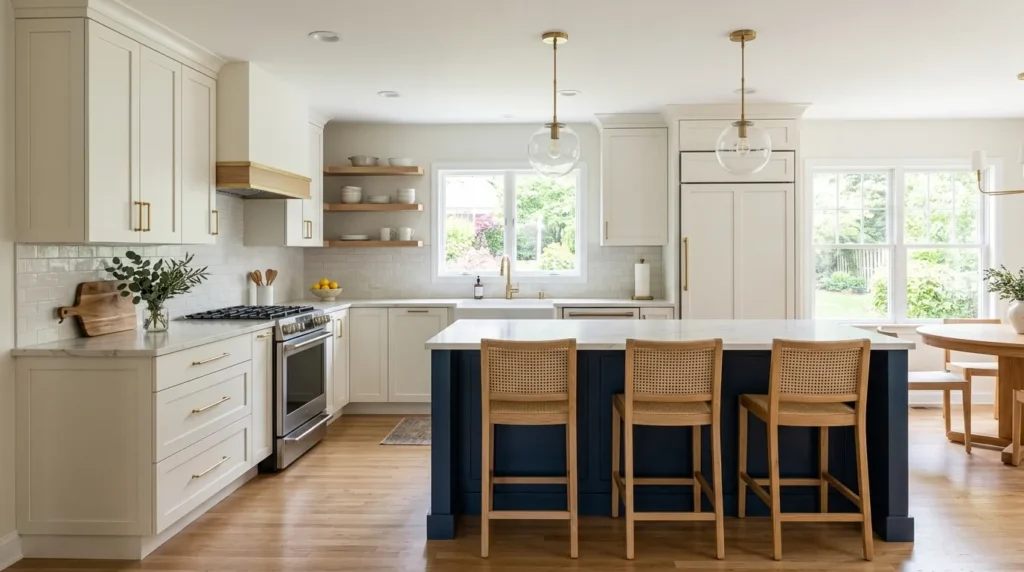
Sometimes choosing just one cabinet color feels unnecessarily limiting. Two-tone cabinetry allows you to combine a lighter perimeter with a darker island, or use one color on the lower cabinets and another on top.
This approach is especially useful in open-concept homes because cabinet colors can help visually define the kitchen without walls.
A classic combination is white upper cabinets with a darker lower cabinet or island. Another option is natural wood paired with painted cabinetry.
The most important consideration is coordination. The two colors don’t have to match, but they should share an underlying relationship. Warm white and warm wood usually work naturally together, as do soft sage and creamy ivory.
How To Style It
Start by choosing the cabinet color you want to dominate the room. Use the second shade as an accent rather than giving both colors equal visual weight.
For example, warm white perimeter cabinets with a deep navy island create a clear focal point. Sage lower cabinets with white uppers can make a smaller kitchen feel colorful without becoming visually crowded.
Keep the countertops and backsplash relatively cohesive so the cabinet colors remain the stars.
Hardware can either match throughout the kitchen or vary subtly by zone, although using one consistent finish is usually the easiest way to maintain a polished appearance.
Choosing the Right Cabinet Color for Your Kitchen
Before ordering paint or committing to a refinish, take a few minutes to evaluate the kitchen as it actually exists.
Start with natural light. A color that looks beautiful in a sunny showroom may appear much darker in a north-facing kitchen. Observe your space in the morning, afternoon, and evening.
Look at fixed finishes. Countertops, flooring, backsplash tile, and appliances are expensive to replace, so your cabinet color should work with them.
Check undertones. Hold your paint samples directly beside the countertop and backsplash. This is one of the easiest ways to spot whether a cabinet color is too warm or too cool.
Test large samples. Small paint chips can be misleading. Paint a larger sample board and move it around the kitchen.
Think about maintenance. Very light and very dark finishes can both show certain types of dirt or fingerprints. Consider how much daily cooking and traffic your kitchen receives.
Consider resale appeal. If selling your home is a possibility in the near future, timeless neutrals may give you more flexibility. If you’re staying for years, you can afford to choose something more personal.
How Cabinet Color Changes a Kitchen
Color does more than decorate a cabinet. It changes how the entire room is perceived.
Light Colors
White, ivory, and pale blue can make a kitchen feel open and airy. They are particularly useful in smaller spaces or kitchens with limited visual separation.
Medium Neutrals
Greige, taupe, and muted green create balance. These colors provide more personality while remaining relatively easy to coordinate.
Dark Colors
Navy and charcoal add depth and contrast. They can make a kitchen feel more sophisticated, especially when balanced with lighter countertops and good lighting.
Natural Wood
Wood introduces both color and texture. Instead of creating a completely uniform surface, the natural grain adds movement and warmth.
There isn’t one universally “best” cabinet color. The best choice is the one that works with your lighting, architecture, existing materials, lifestyle, and personal taste.
Common Cabinet Color Mistakes to Avoid
Even beautiful colors can look wrong when they’re used without considering the surrounding space.
Choosing Paint From a Tiny Swatch
Always test the actual color in your kitchen. Lighting can dramatically alter how it appears.
Ignoring Undertones
A gray with a blue undertone can clash with warm beige flooring. Similarly, a creamy cabinet can look yellow beside a very cool countertop.
Using Too Many Competing Colors
Your kitchen doesn’t need a different color for every surface. Choose a dominant palette and introduce accents carefully.
Forgetting Hardware
Cabinet hardware is small, but there are usually dozens of pieces in a kitchen. Its finish can significantly influence the overall appearance.
Skipping the Lighting Plan
Cabinet color can look completely different under warm LED bulbs compared with natural daylight. Check your samples at night as well as during the day.
Following Trends Blindly
Pinterest is wonderful for inspiration, but your kitchen doesn’t have to copy a trend exactly. Choose colors that you’ll enjoy living with beyond the current season.
Frequently Asked Questions
What is the most timeless cabinet color?
White remains one of the most timeless choices because it works with a wide range of countertops, flooring, backsplashes, and decorating styles. Warm white can provide a softer appearance, while crisp white works well in contemporary kitchens.
What cabinet color makes a small kitchen look bigger?
Light colors such as white, ivory, and pale blue can help a small kitchen feel more open because they reflect light and create less visual weight. Keeping upper cabinets light can be especially helpful in compact spaces.
Are dark kitchen cabinets a good idea?
Yes. Navy, charcoal, and other dark cabinet colors can create a sophisticated look. They work best when balanced with adequate lighting and lighter elements such as countertops, walls, or backsplashes.
Should kitchen cabinets be lighter or darker than countertops?
Either can work. Lighter cabinets with darker countertops create contrast, while dark cabinets with light countertops create a crisp, dramatic effect. The decision should be based on the overall palette and the amount of natural light.
Is sage green still a good kitchen cabinet color?
Sage green is a versatile choice because its muted undertones allow it to work similarly to a neutral. It pairs particularly well with white, natural wood, brass, stone, and other earthy materials.
Should all kitchen cabinets be the same color?
Not necessarily. Two-tone kitchens can add depth and help create a focal point. A different color on an island or lower cabinets is a common way to introduce contrast without overwhelming the space.
How do I choose the right cabinet paint color?
Start by identifying the undertones of your countertops, flooring, and backsplash. Then test several large paint samples in your kitchen and observe them in both natural and artificial light before making a final decision.
Conclusion
Choosing a cabinet color is one of the most effective ways to change the feeling of a kitchen without completely rebuilding the space. The right shade can make a room feel brighter, warmer, calmer, more dramatic, or more connected to the rest of your home.
If you love a classic look, white and creamy ivory offer plenty of flexibility. Greige and taupe provide understated warmth, while sage and dusty blue bring in gentle color. For something more dramatic, navy and charcoal can create a strong focal point. Natural wood adds texture and warmth, and two-tone cabinetry gives you the opportunity to combine several of these ideas.
Before making your final choice, always consider your kitchen’s natural light, existing materials, undertones, and everyday use. Most importantly, test the color in the actual room rather than relying solely on an online photograph or tiny paint chip.
You don’t have to transform everything at once. Start with the cabinet color that feels most natural for your home, build the surrounding finishes around it, and let the kitchen develop into a space that feels beautiful and comfortable to use every day.
Related Articles
- 15 Warm and Cozy Kitchen Decorating Ideas
- Modern Farmhouse Kitchen Ideas for a Timeless Look
- Small Kitchen Ideas That Maximize Every Inch
- Beautiful Neutral Home Decor Ideas
- Easy Kitchen Updates That Make a Big Difference